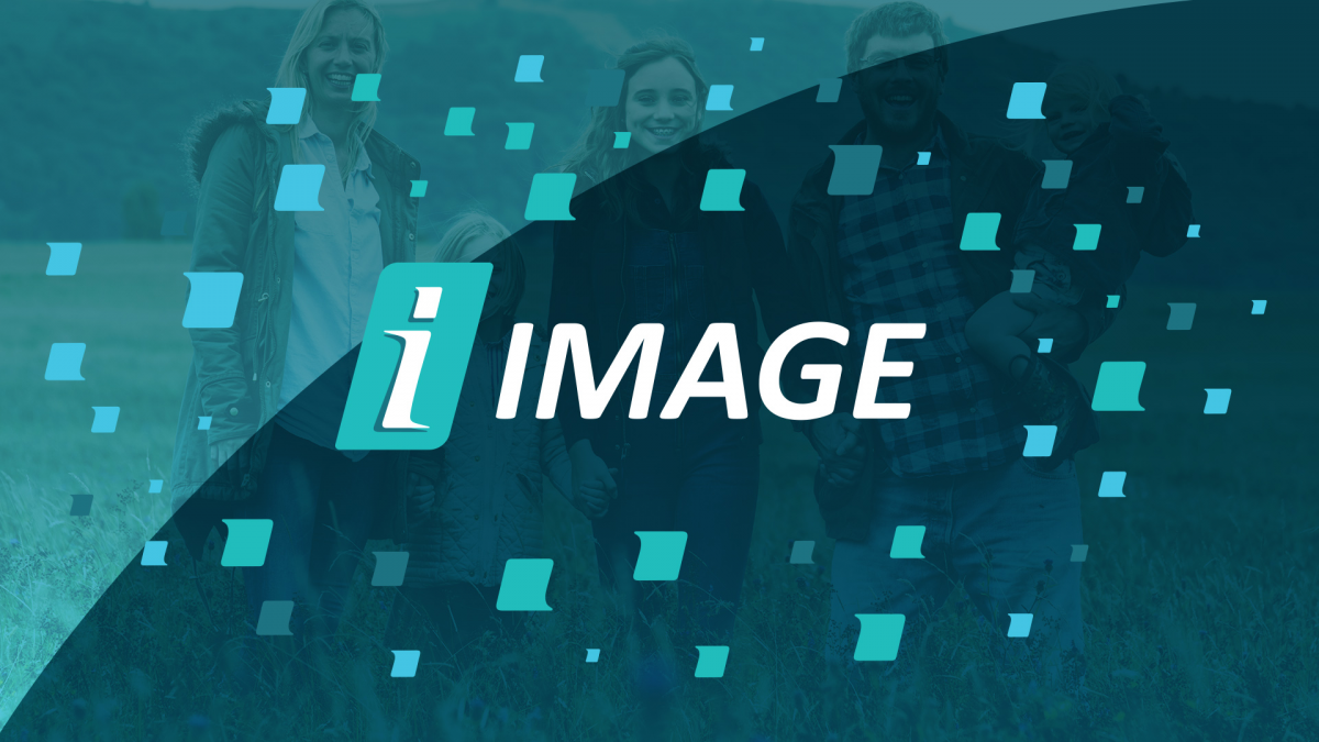
Image Strategic Partners
Working with a lot of B2B brands, we get plenty of requests for work that looks and feels professional. A professional feel is an understandable request, but there’s only so many ways to be professional and a lot of them are boring. This challenge didn’t stop us from creating a brand that hit the mark without sacrificing creativity.
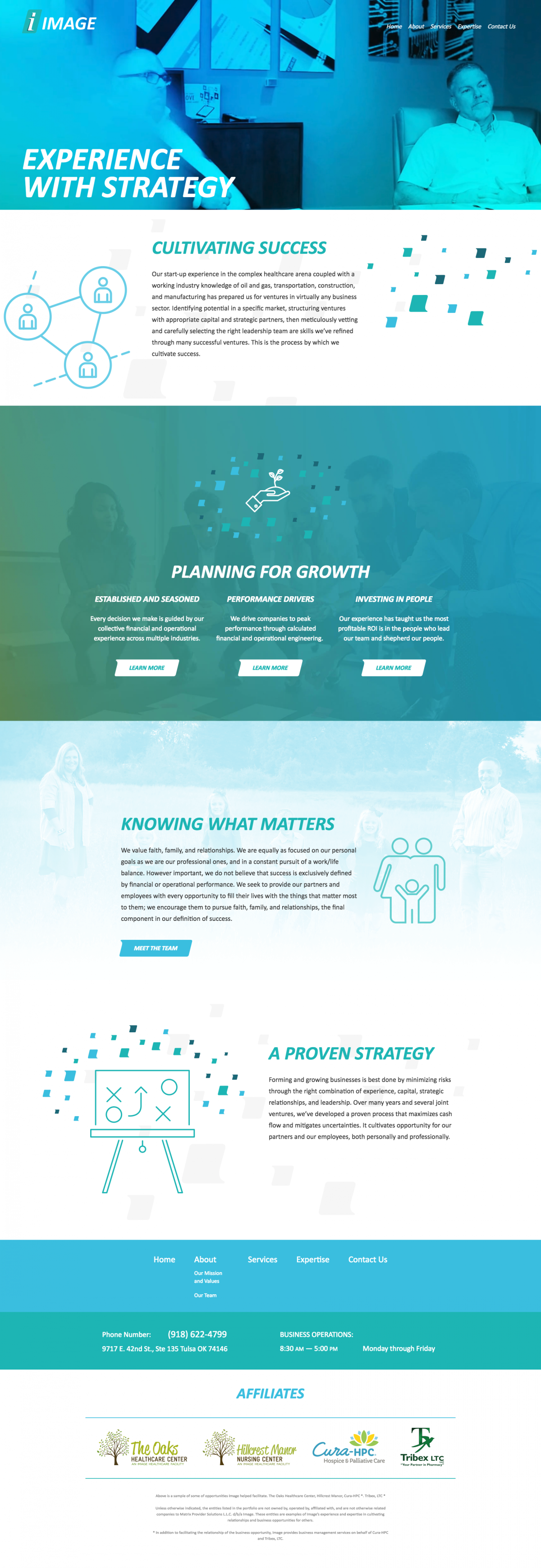
When presented with the paradox of wanting to be professional but not boring, serious but not impersonal, and modern but not trendy, we refreshed the Image brand with sharp lines and an often-overlooked element of typography. The stylized dot of the i, called a tittle, served as an energizing accent we carried throughout the website and brand system.
As a private equity firm, the website was geared toward banks, potential investors, and other parties that methodically vet Image prior to inking a new loan or joint venture agreement. With this research-minded audience in mind, we structured the website to convey Image’s expertise while not forgetting the more personal aspects of business. We dedicated several sections of the site to discussing their faith, family, and business philosophy so viewers can get a glimpse of the people behind the brand.
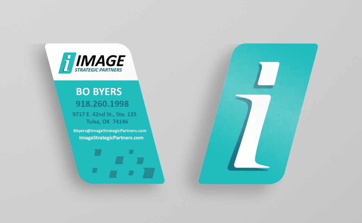
The project was so successful, we had the opportunity to transport the branding from the digital world into the real world by designing and printing custom office branding. We also designed a distinctive dye-cut business card with spot UV treatments for a memorable and professional brand experience.